Designing Digital Kiosk Experiences from the Ground Up at Delosi
Role: Product Designer + Researcher
Duration: 6 months (ongoing)
Problem
Restaurants struggle to meet customer demands for faster service during lunch. The goal was to create a digital kiosk that:
Simplifies ordering
Balances speed and usability
Appeals to both tech-savvy and novice users
Additionally, the company aimed to:
Increase transactions by linking orders to customer profiles
Collect data on buying habits to enhance future offerings
Our task was to develop a kiosk solution that fits seamlessly into the store while addressing these challenges and achieving business objectives.
Discovery Phase
The research phase lasted two months and combined contextual interviews with the use of storyboards to effectively communicate and validate the future user journey with participants.
Over 300 minutes of interviews with 10 participants across 4 locations uncovered key insights into user behaviors and pain points.

Insights

1
Customers prioritize speed during busy lunch hours, and any delays discourage them from using kiosks. A faster ordering process is critical to adoption.
“I often skip kiosks because I worry they’ll take longer than waiting in line.” - Nataly
Basically, they feel like having lunch, which is an activity meant to be enjoyed and a relaxation moment, is just another obligation, like completing a work task or paying the electricity bill.
-
“I feel rushed, like others are watching and judging me if I make a mistake.” – Edair
We can even see that there’s embarrassment about others knowing or seeing that they can’t make a purchase on their own in a self-service environment.
Design Principles
Speed
Focus on helping customers order quickly, ensuring they feel confident in fast service, even with queues.
2
Many users feel social pressure when ordering, especially in self-service environments. Creating a stress-free experience where they can explore options at their own pace fosters confidence.
“When I’ve been at supermarkets and someone else wants to use it, I start doing it faster and feel afraid of making a mistake.” – Nataly
-
It was eye-opening for us to learn that people feel this pressure while doing something as routine as buying their lunch.
Design Principles
Speed
Focus on helping customers order quickly, ensuring they feel confident in fast service, even with queues.
Freedom
Customers can freely choose their meals and find what they want, using either the kiosk or regular queue.
3
Less tech-savvy users value guidance and familiarity. Clear instructions and optional assistance are necessary to encourage first-time usage and adoption.
“The staff helped me understand the kiosk, which made me comfortable using it.” – Angela
Having someone to guide and assist you is something we must consider for our less tech-savvy customers.
Design Principles
Speed
Focus on helping customers order quickly, ensuring they feel confident in fast service, even with queues.
Freedom
Customers can freely choose their meals and find what they want, using either the kiosk or regular queue.
Guidance
The interface should resemble everyday devices like smartphones, ensuring approachability and a constant help option from current staff or future assistants.
4
Lack of clarity about promotions and available options deters users from using kiosks. Ensuring complete transparency in the interface empowers users to make informed decisions.
“I didn’t know how to redeem my discount, so I didn’t even try.” – Edair
This reveals a hard truth about our customers: they are willing to sacrifice more of their time to compensate for the lack of information they perceive about how to access our products.
Design Principles
Speed
Focus on helping customers order quickly, ensuring they feel confident in fast service, even with queues.
Freedom
Customers can freely choose their meals and find what they want, using either the kiosk or regular queue.
Guidance
Informative
Our design must eliminate this uncertainty by making all relevant information easily accessible, regardless of the channel.
The interface should resemble everyday devices like smartphones, ensuring approachability and a constant help option from current staff or future assistants.
Proof of Concept

Storyboards
Storyboards served as a key tool during the research phase, not only to communicate the envisioned kiosk experience but also to gather feedback from participants. Each storyboard illustrated:
The user’s current pain points in traditional ordering processes.
The future journey, showing how kiosks would streamline ordering, reduce anxiety, and provide clear guidance.
These visuals helped participants articulate their needs and validate design concepts before the prototypes were developed.
Experience
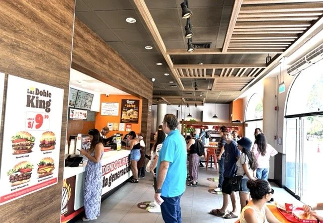
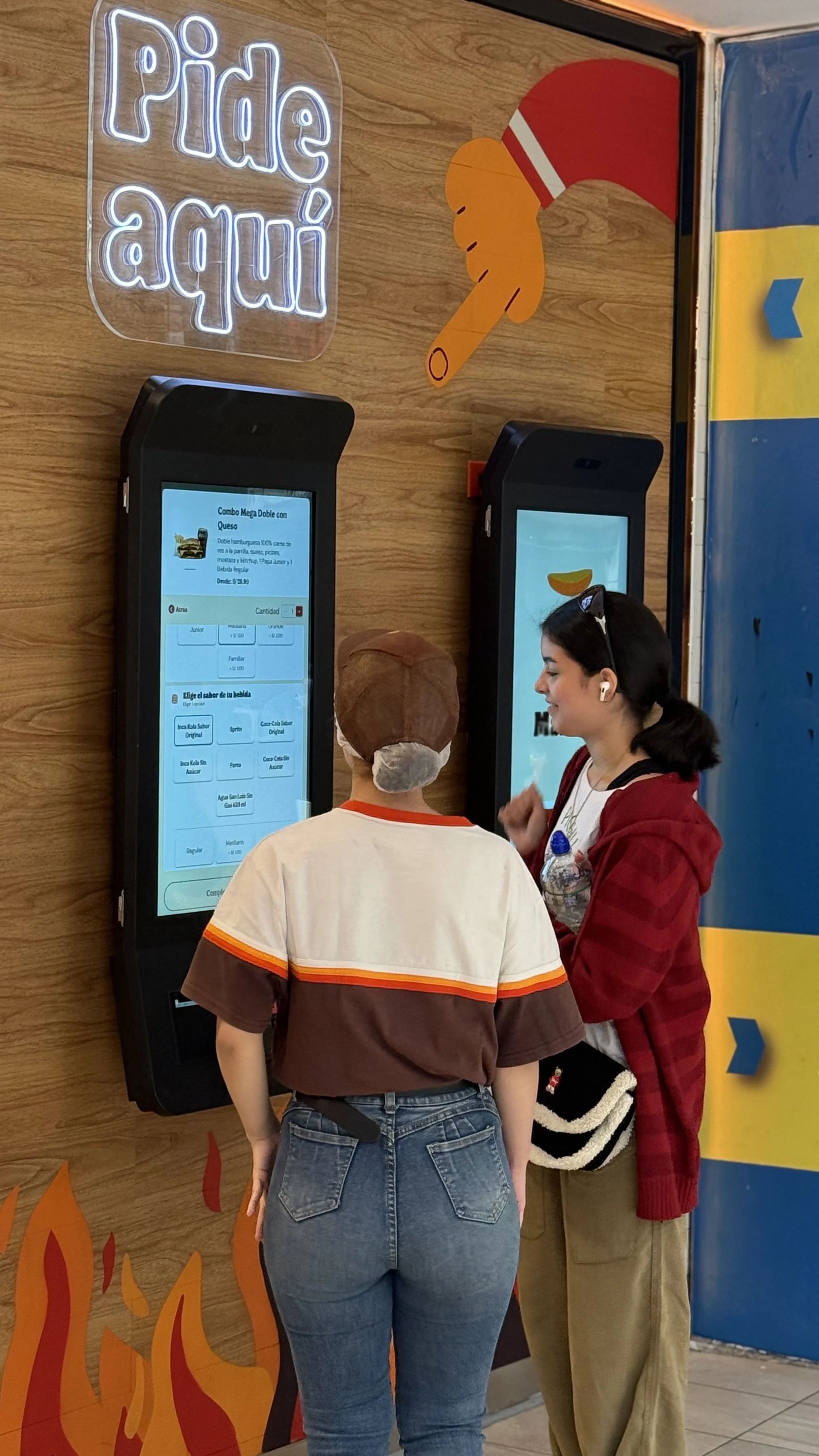
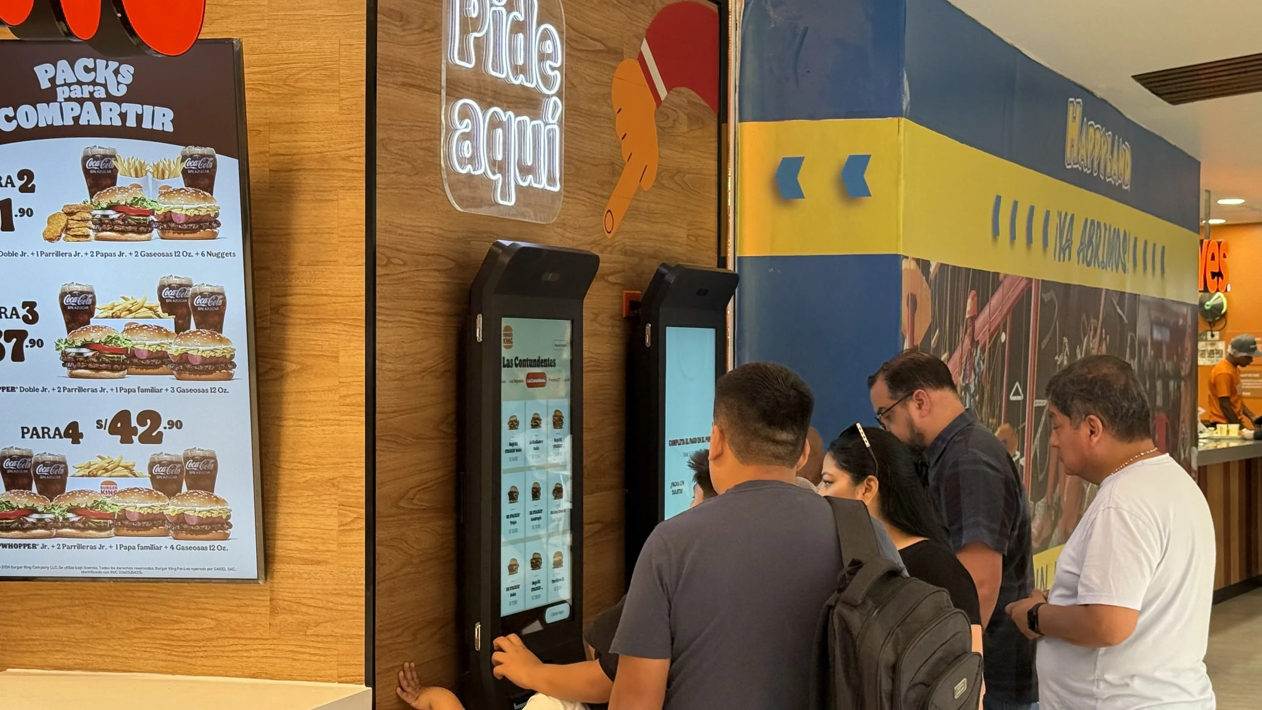
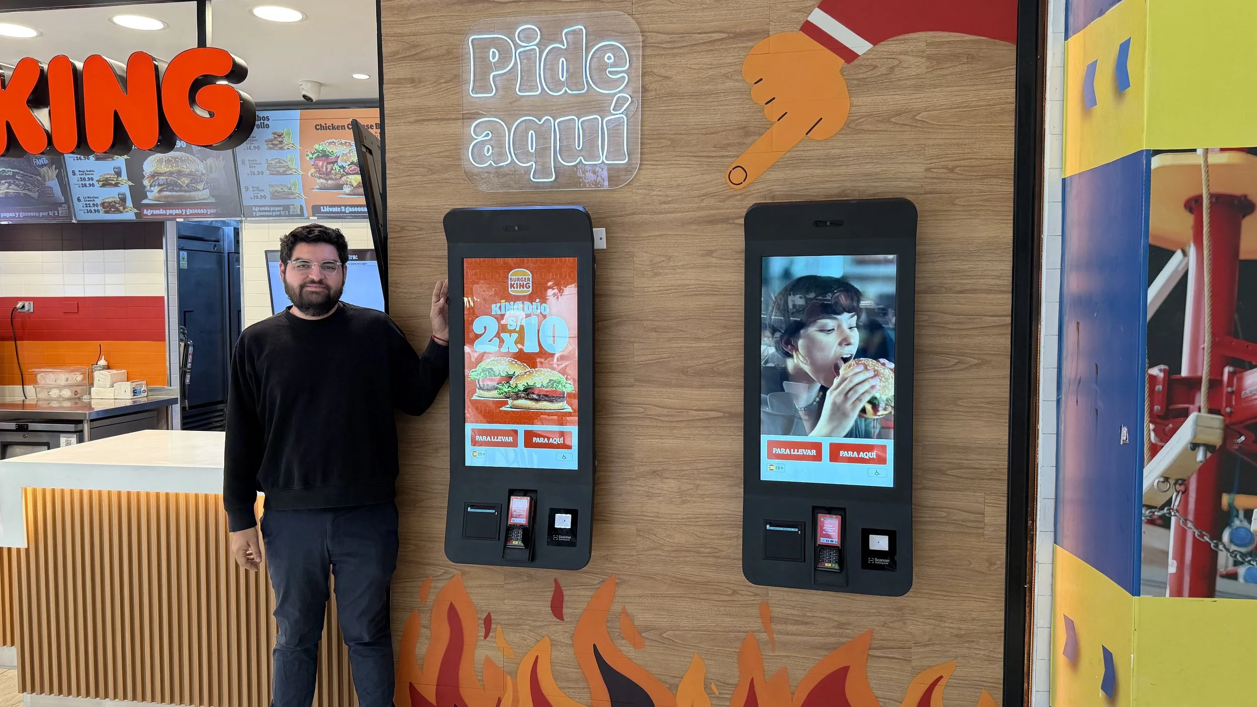
In-store experience
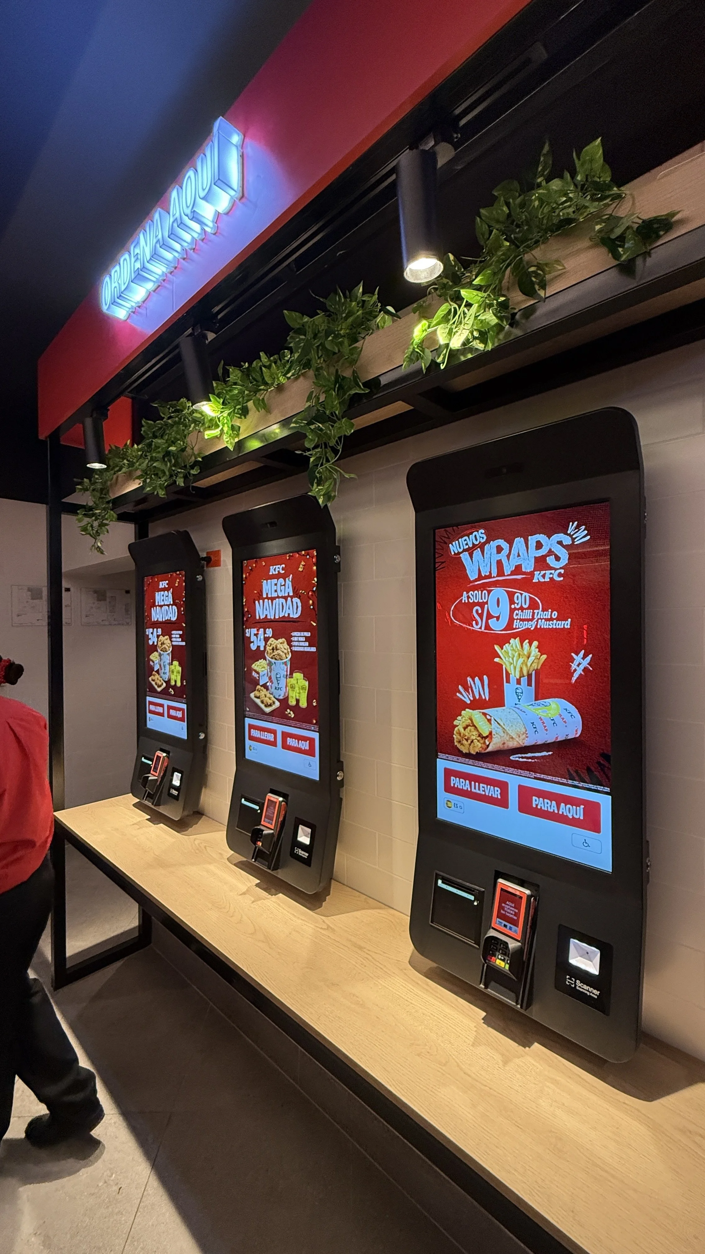
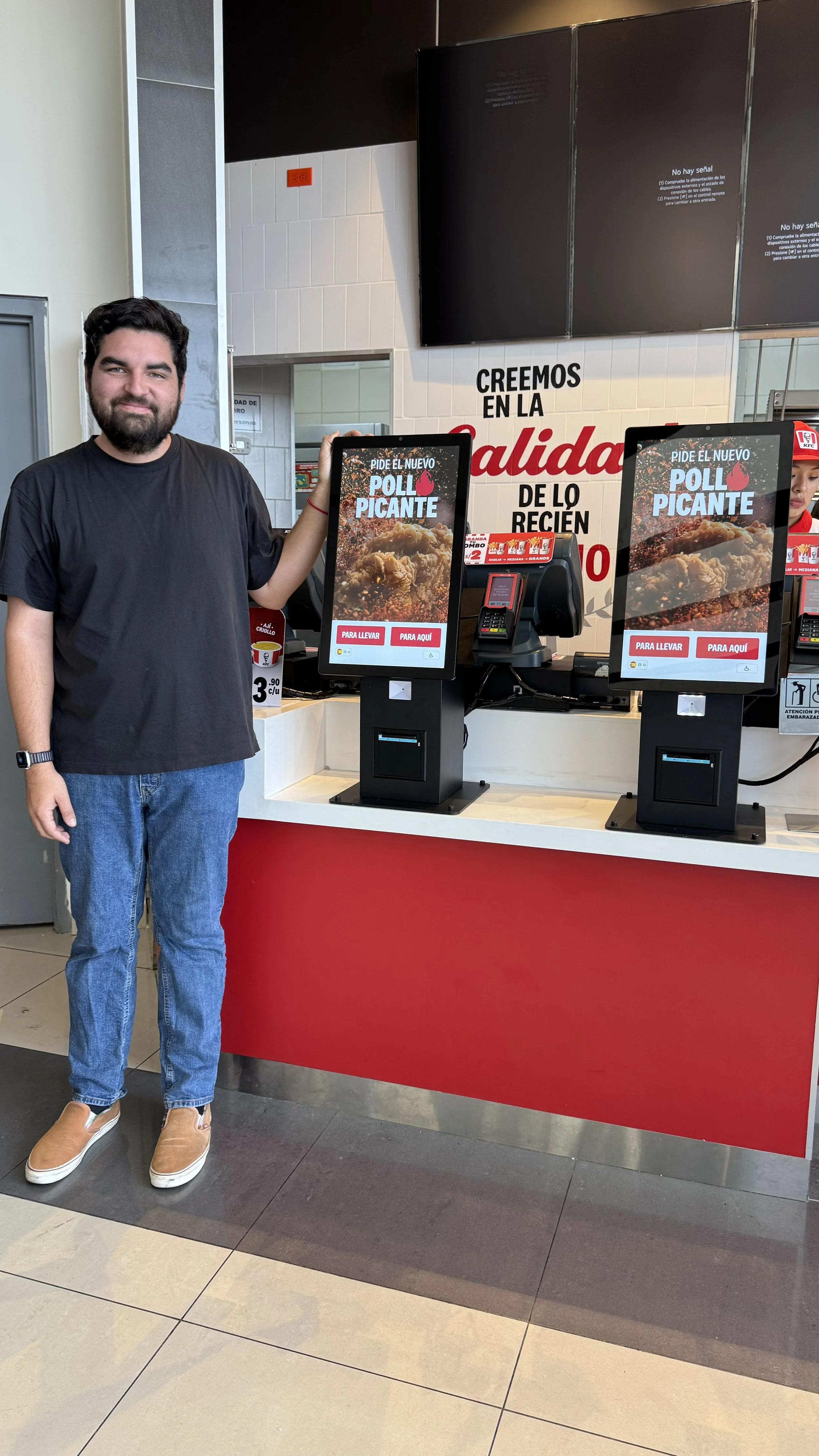
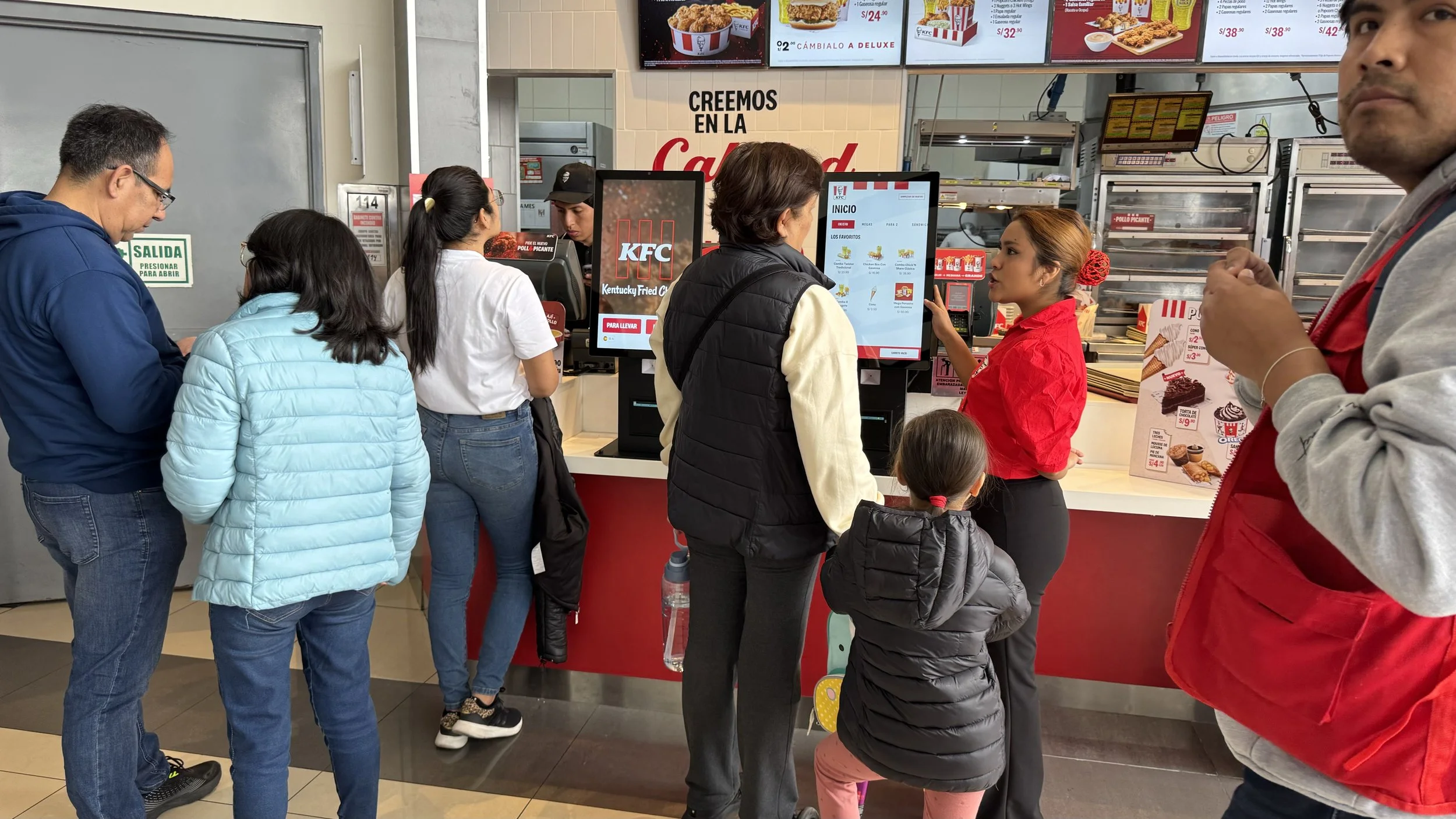
Intercepting the user
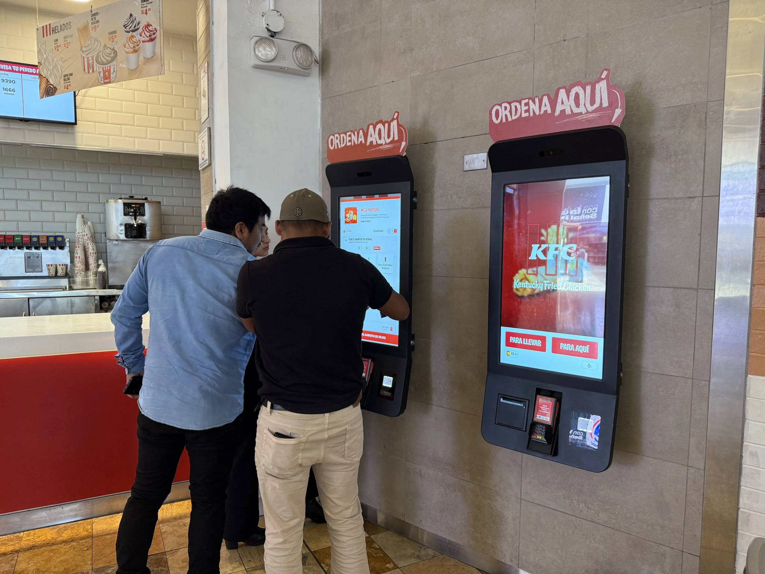
Position the kiosk along the customer’s natural path at a 45-degree angle to maximize visibility and approachability. This placement invites interaction and provides an alternative to the counter, increasing engagement. Clear signage or prompts can encourage usage, improving efficiency and reducing congestion.
Kiosk experience
Adapting to our context
Understanding the physical realities of users in Peru, where the average height is 1.54–1.66 m, allows us to design interfaces that are both ergonomic and secure:
Private Zone for Sensitive Inputs: Sensitive fields, such as ID numbers for digital receipts, are positioned lower on the screen within the user’s private zone, leveraging their body as a natural shield to ensure privacy.
Accessible Controls: Interactive elements remain in the public zone but are placed within easy reach for users, ensuring comfort and usability without compromising security.
This approach balances usability and privacy, creating an intuitive and inclusive kiosk experience.

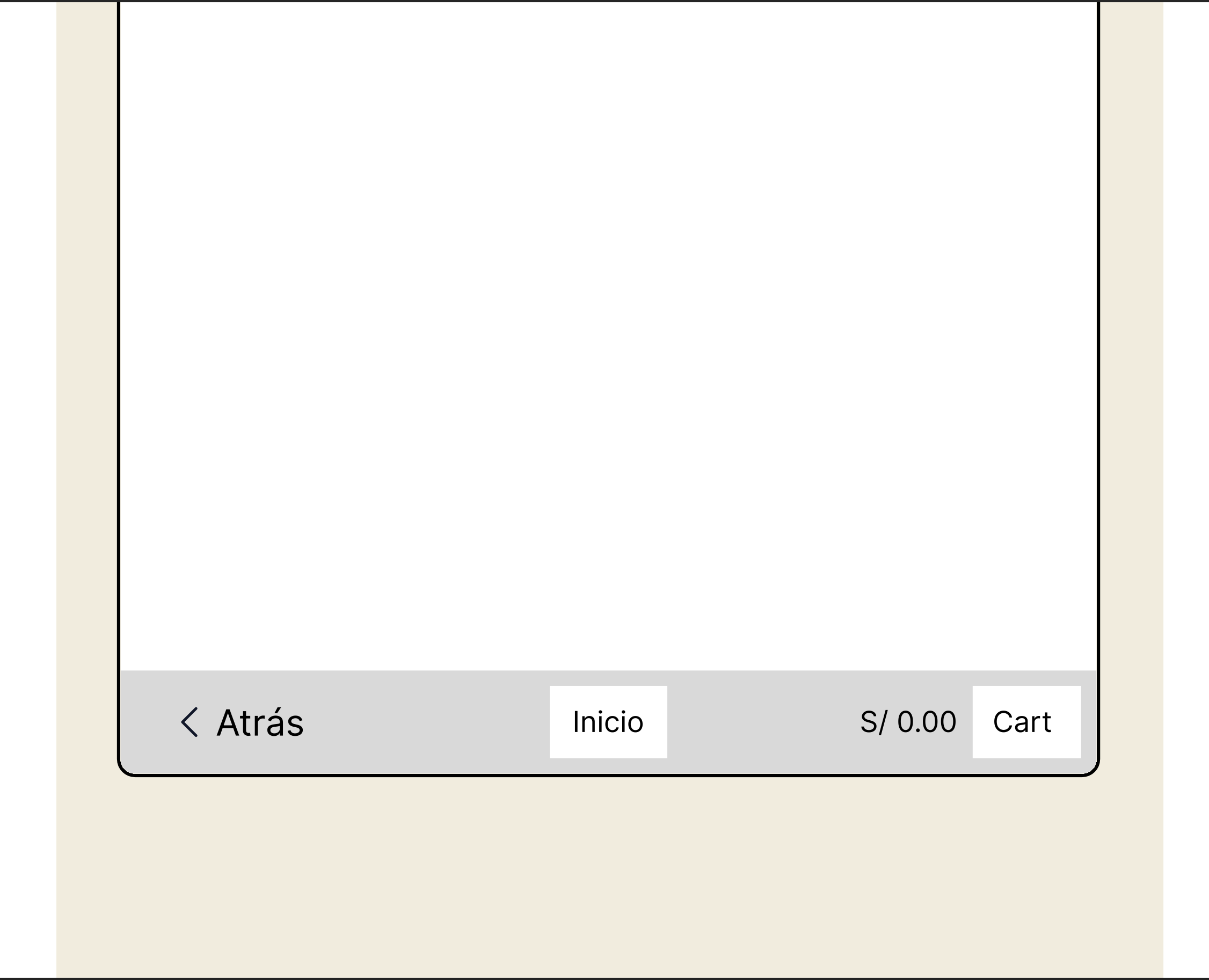
Guidance
Familiar Interactions Inspired by Everyday Devices
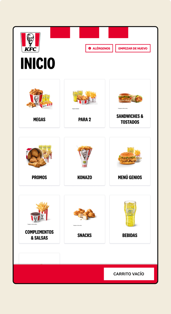
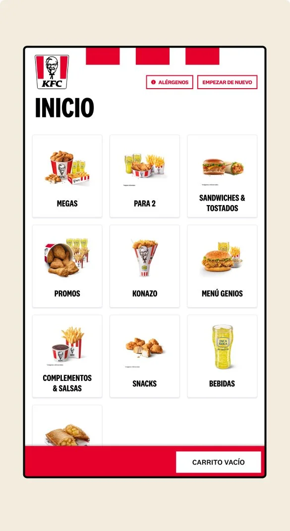
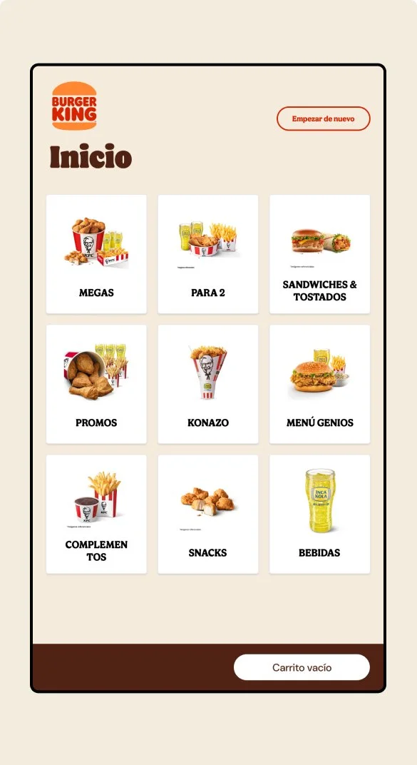
To ensure an intuitive user experience, we designed kiosk navigation to mimic familiar smartphone layouts. Core navigation elements are at the bottom, leveraging users' habits and muscle memory for comfort.
Familiar Layout: The bottom navigation bar offers easy access to functions like “Back,” “Home,” and “Cart,” minimizing the learning curve.
Ease of Use: This design accommodates users of different heights and tech-savviness, creating a consistent experience.
This approach connects new technology with established user behaviors, enhancing confidence and usability.
Guidance
Empowering Didactic Exploration
To enhance user confidence and ease, we aligned the kiosk interface with common digital experiences, such as smartphones. Navigation elements at the bottom improve accessibility and comfort, making interactions intuitive. We prioritized clear navigation with:
• Large Buttons: For easy access for all tech skill levels.
• Quick Category Navigation: Enabling swift, frustration-free searches.
This design promotes a didactic experience, allowing users to navigate comfortably while fostering independence and control.
Speed
Freedom
Guidance
Informative
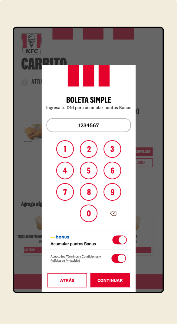
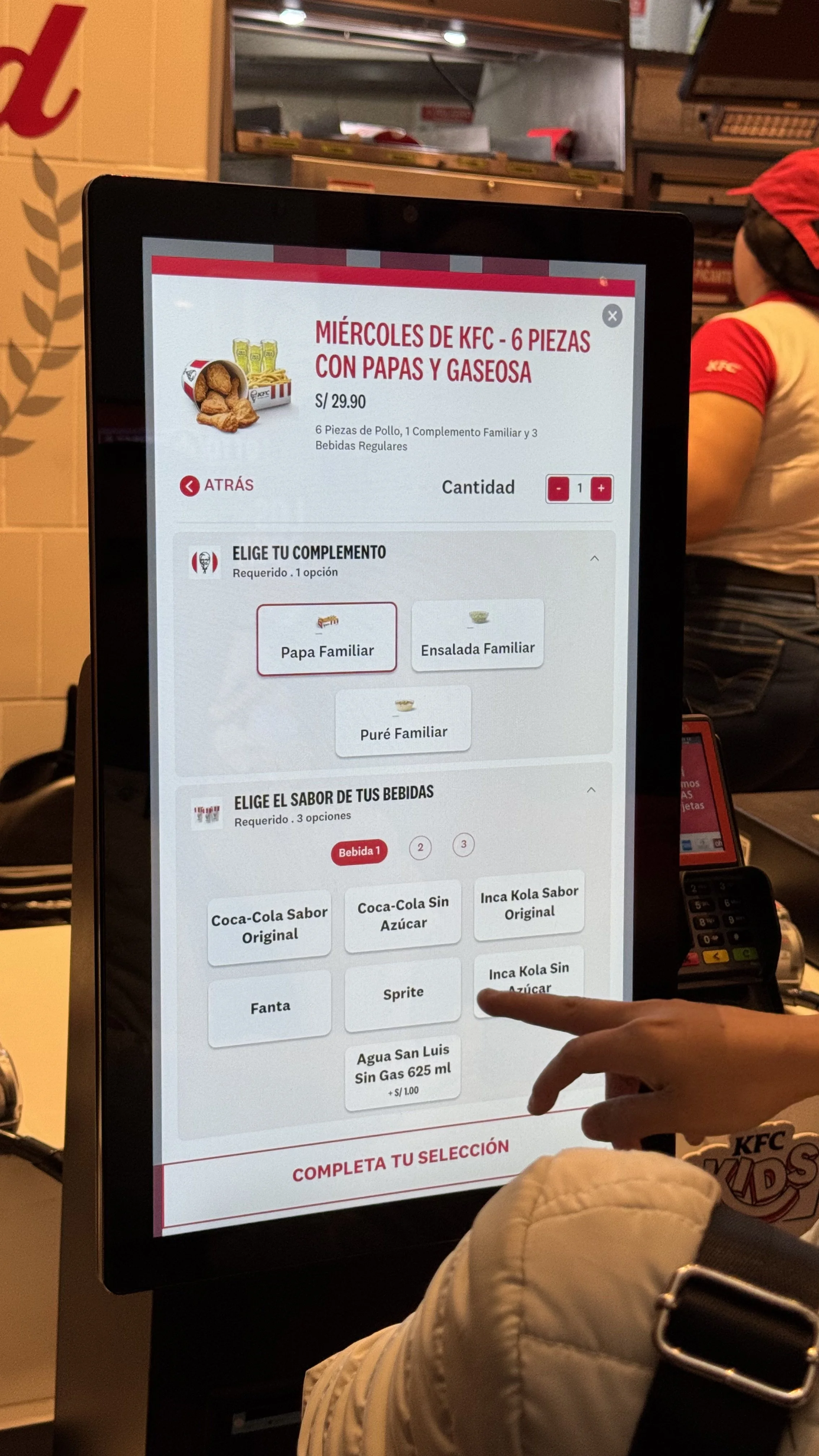
Clear Communication and Familiar Interactions
To enhance user confidence, we combined transparent copy with interactive elements inspired by everyday technology.
• Transparent Copy: Simple, straightforward language ensures clarity at every step.
• Familiar Inputs: The design mimics common digital tools, such as numeric keypads resembling those on smartphones, making the experience intuitive and approachable.
This approach fosters trust and ease, ensuring users can navigate the kiosk confidently and complete tasks effortlessly.
Speed
Freedom
Guidance
Informative
Informative Design: Visual Cues Beyond the Interfaces
Given that our payment terminal isn’t integrated into the kiosk, we made sure users could confidently complete tasks beyond the digital interface. We incorporated visual cues that connect the screen to the physical surroundings.
• Clear Guidance: Icons and text illustrate how to use external devices, like payment terminals, ensuring users know exactly what to do next.
• Intuitive Connection: These cues make the process seamless, reducing hesitation and enhancing the overall experience.
This approach ensures every step—both digital and physical—is informed and straightforward, fostering trust and efficiency.
Speed
Freedom
Guidance

Informative
Scalable Design: Extending the Experience Across Brands
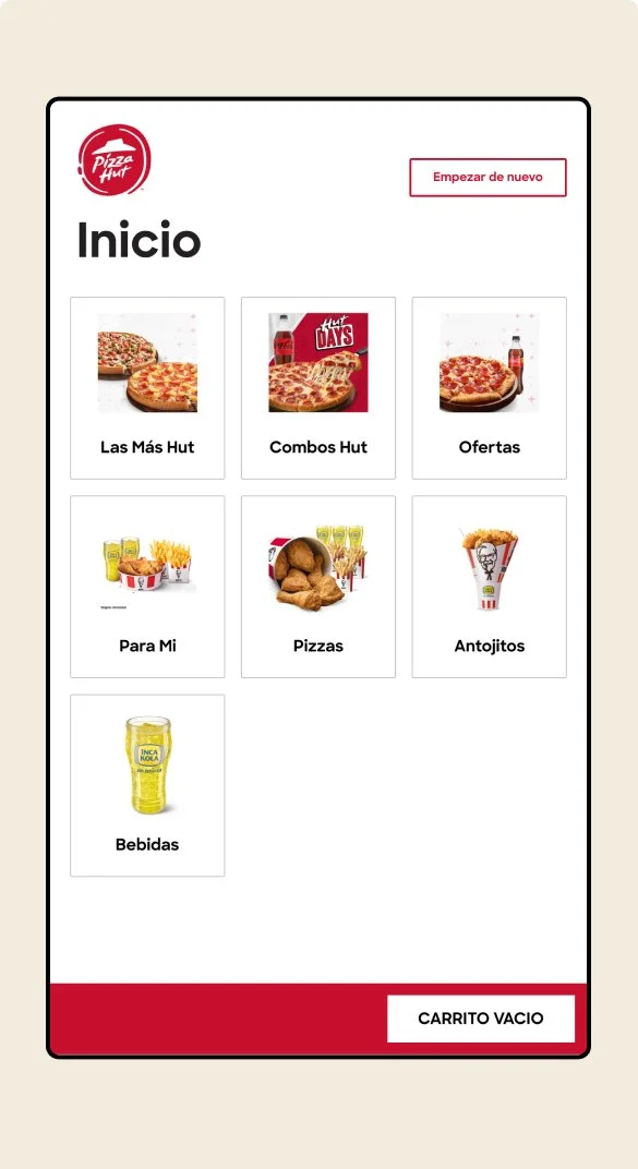
This approach allowed us to create cohesive yet distinct kiosk experiences for all three brands, proving the scalability and flexibility of the research-driven design process. By leveraging the success of the initial implementation, we strengthened the foundation for future digital products across the portfolio.
Impact
The kiosk initiative achieved significant business results and scalability. From July to December 2024, we successfully installed over 70 kiosks, paving the way for a rapid expansion plan. By the end of 2025, the kiosk experience will be deployed across 190+ stores, with each location featuring at least two kiosks. This large-scale implementation demonstrates the effectiveness of the research-driven design and its ability to meet both user needs and business goals.
70+
Digital Kiosks installed by EOY 2024
190
Digital Kiosks installed by EOY 2025
Takeaways
The user-centered research conducted for this project laid the foundation for a scalable kiosk experience that seamlessly adapted to multiple brands, including KFC, Pizza Hut, and Burger King. Each interface was customized to reflect the unique branding of each restaurant while preserving the core usability principles of speed, freedom, guidance, and information.
By leveraging a modular design system, we maintained consistency across brands while tailoring visual and content elements to their specific needs. This scalable approach not only ensured efficient deployment but also reinforced the flexibility of research-driven design, setting the stage for future digital innovations across the portfolio.
Portfolio
-
Work at Zumba
Become an Instructor Improvements | Case Study
-
Work at Scotiabank
Credit Card Claims | Case Study