Scotiabank:
Redesigning the Credit Card Digital Experience

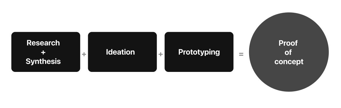
Role & Duration
Product Designer
Research, Synthesis, Ideation, Prototyping and Testing.
2019-2020
Overview
Scotiabank’s Credit Card division got several claims and negative reviews because users couldn’t understand the monthly statement, so the Design team was tasked with the goal of reimagining the Credit Card Statement experience based on a clear understanding of the needs and the role it plays for digital savvy Credit Card users.
Goal
Understand the role of the Account Statement in our customers' experience.
60%
Credit Card claims are related to information (or lack thereof) shown on the Account Statement.
Understanding the role it plays…
1
Which information is relevant to the users?
2
Beyond a Piece of Paper
3
Needs & Pains
“Inquiring about which information is most useful for customers who use a credit card.”
“Think of the account statement as an integral part of a service”
What is at the root of many of these complaints? What is telling us about the credit card experience?
10
User Interviews
2
SME Interviews

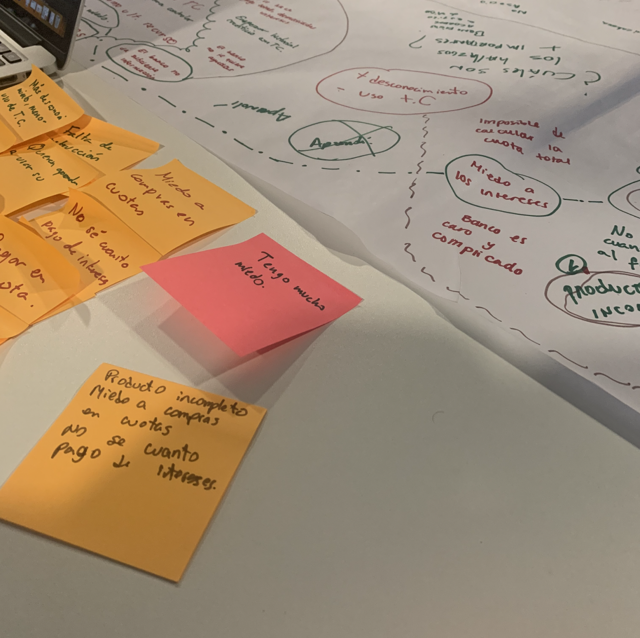
Synthesizing data using Affinity Diagrams
Journey Map

Insights
1
Fear has become a fundamental sentiment in the use of a credit card. This constant in the credit card usage experience seems necessary to protect oneself from bad experiences or financial problems.
2
Interest rates and installments: If you don't understand them, it's better not to use it. It's something that is better to avoid. Resulting in partial incomplete credit card use.
3
Learning how to use my credit card depends solely on me. Users wanting to learn how to use their credit card rely solely on themselves. It is not directly related to the credit card user experience.
4
The timing of the account statement's arrival is arbitrary in relation to the customers' information needs. This diminishes its relevance. Its primary use appears to be for double-checking and verification purposes.
“It’s like the sea: “I like it, but it can be dangerous, so we must respect it.”
“It’s like using a smartphone only for making calls”
“I use that one (referring to another banks Credit Card) because it’s the one that has given me the most ease to understand it.”
Focus

With four main modules:
Learning to use my credit card
Paying my Credit Card
Credit card expenses
Installment Purchases
Ideation
Co-creation Workshop
Participants, including designers, developers and stakeholders divided into teams of 4, had to turn these insights into opportunities, using How Might We’s as a prompt standalone solutions.
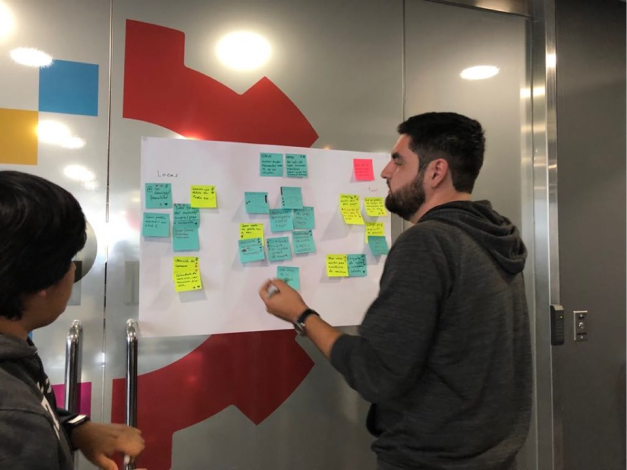
Here I’m helping teams cluster and prioritize their ideas, so they get to sketching!
One of the teams idea designed to help users struggling financially and only meeting their minimum payment.
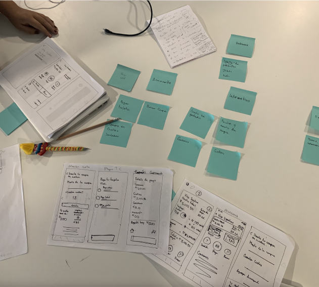
Prototyping + Testing
Low fidelity prototyping
Collecting all input from previous activities, we started prototyping.
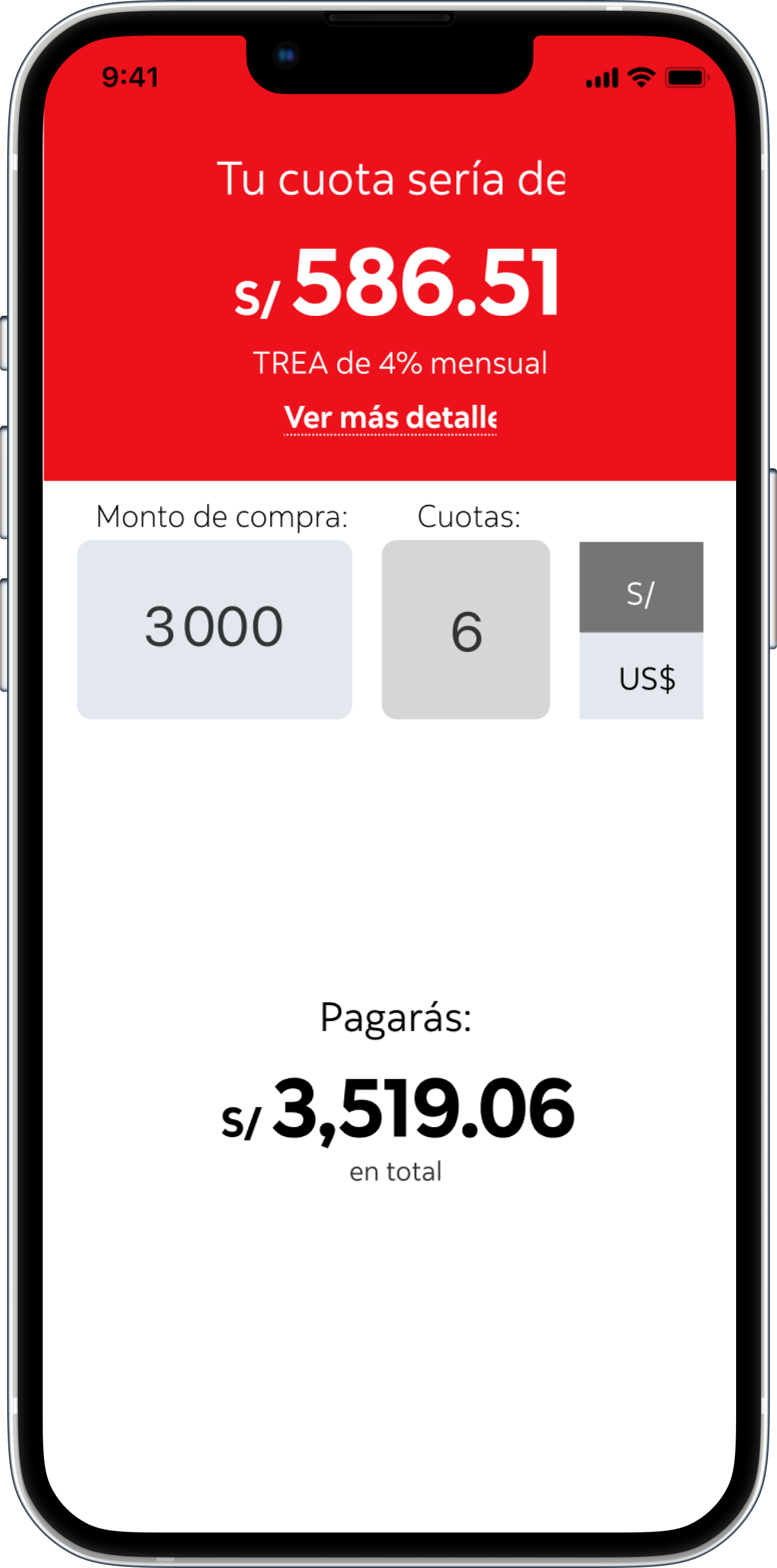
Giving much emphasis on friendlier terminology, rich merchant meta data, installments simulation for financing purchases and easier to understand payment options.
Usability testing
Initial user test were not very promising as users could not complete simple tasks such as completing their monthly payment.
Users also mentioned there was no easy way to see their recent transactions and icons were not very self explanatory.

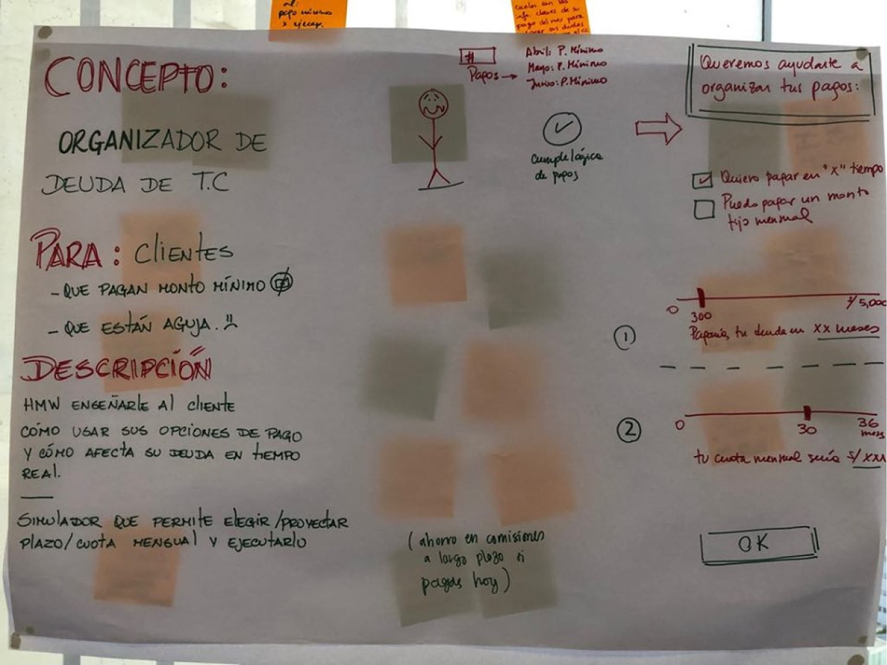
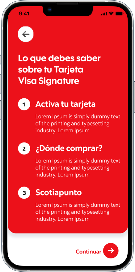
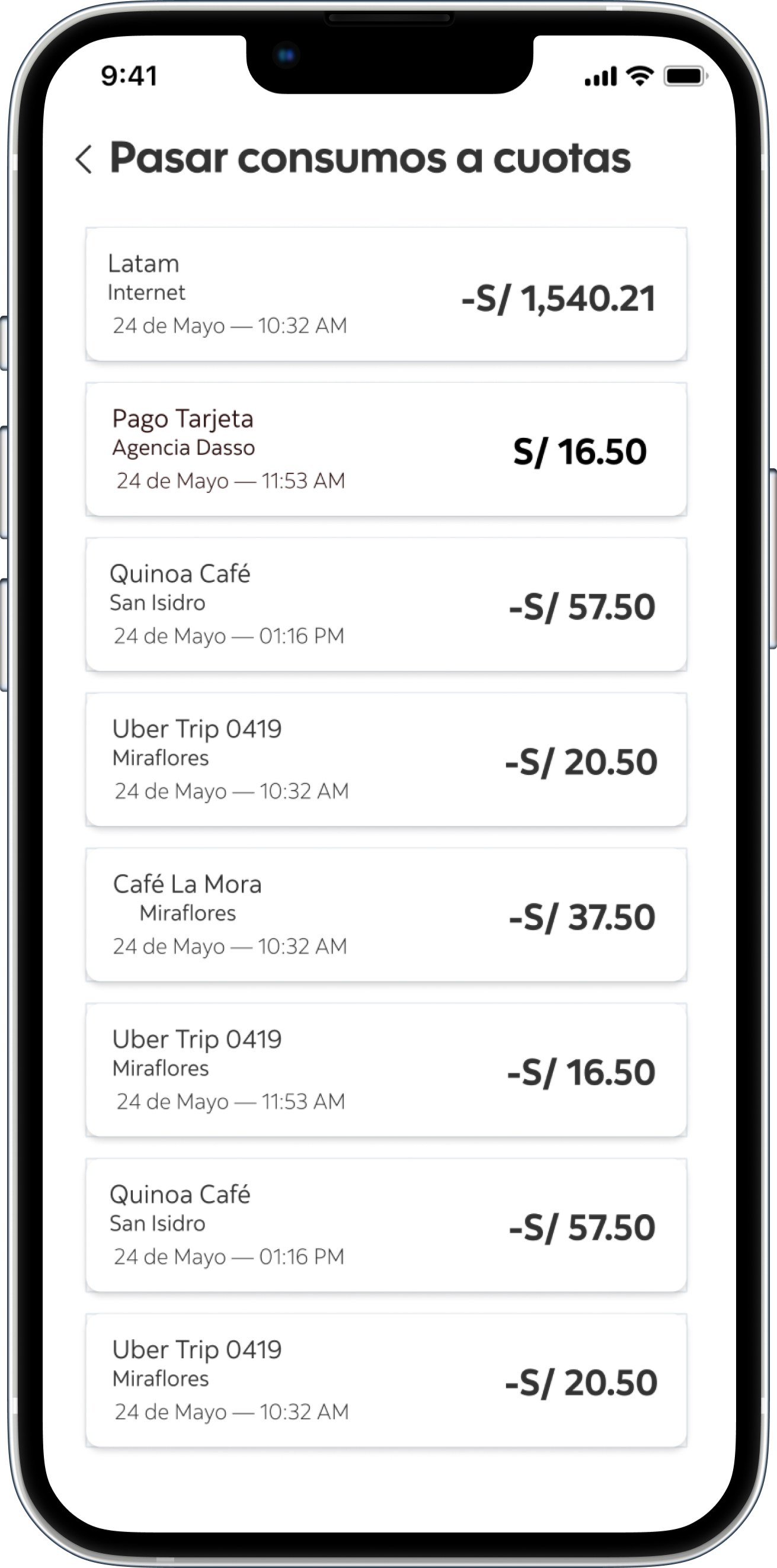
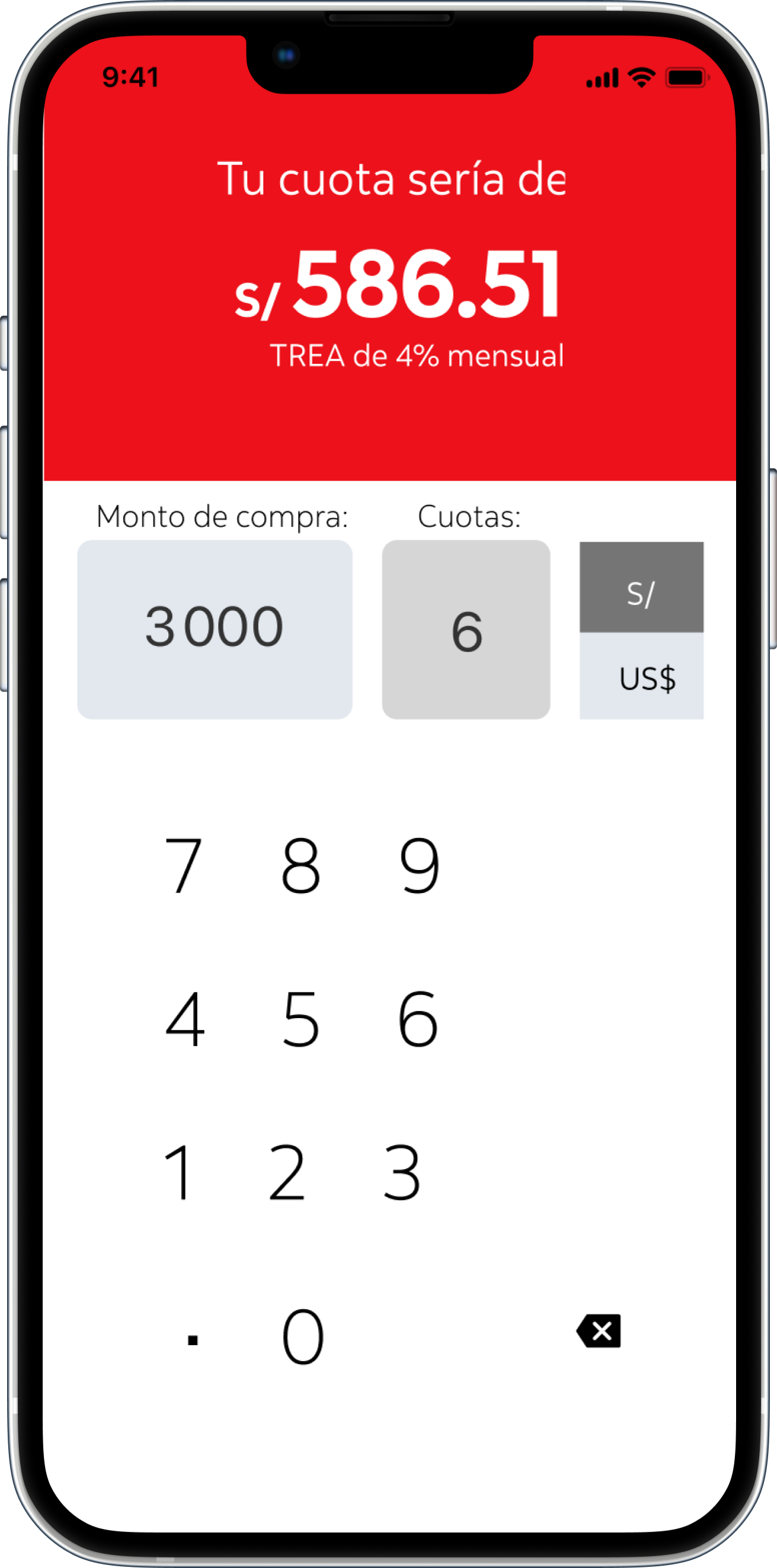
Proof of Concept
1
Learning to use my credit card
Include an onboarding to teach our customers to use the product, this would show the first time you enter the credit card details and serves as a guide on how to properly use it. Users can come back to it at any time using a help button.
Helping users mitigate their fear when using their Credit Card.


2
Credit Card expenses + paying
User friendly communication using copy that our users actually understand was key here, this comes attached with translating banking terms and merchant names to a language our users can understand.
Providing greater detail, rich data, information and insights on how, when and how much they’re spending.


3
Installment Purchases
Giving deeper insights on how our users can take advantage of their credit card, such as using the installments payment, or using the 45 days to pay your balance interest free.
Highlighting these features helps users build confidence on using their Credit Cards.


Adding value
1
First purchase
The proposed onboarding adds value to the user by using simple language to explain how a complex product works.
2
Using your Credit Card
Friendly communication, clear information about billing cycles, spending habits and payment options mitigate the fear associated with the product.
3
Taking full advantage
Having a built-in simulator would add value to the user by providing them with a clear view on how much they would end up paying if buying in installments.
Findings
1
Usability testing tasks and results
View all purchases made on one establishment (100% success rate)
Simulate a purchase in installments ( 84% success rate)
Divide a purchase into installments (100% success rate)
Pay credit card (100% success rate)
Pay up installments in advance (84% success rate)
2
Installments section
For some users, there was some confusion with location and text around installment purchases.
“It’s great that there’s a photo to remind me where I made the purchase; often, I don’t recognize the name.”
“Sometimes, you leave the store and think, ‘I should have bought it in installments.’ It would benefit me and give me peace of mind knowing that if I can’t make it this month, I can convert it into installments without having to call or go to the bank.”
Looking back and reflections
This was without a very challenging yet rewarding project, working in an Agile environment, its not often when you have the privilege to properly go through the complete design process when you also have to deliver design work for the usual cadence. That came with lots of work, stakeholder management and back and forth with users, though all the hard work paid off, this project results were shared with the CEO of the organization, with positive feedback that led to this being prioritized in the product backlog.
Portfolio
-
Work at Zumba
Become an Instructor Improvements | Case Study
-
Work at Scotiabank
A selection of work I did at Scotiabnk